
A landing page that has been executed well sometimes feels like a magic trick. It effortlessly collects names and emails. But behind the scenes, there’s a tight adherence to all the best design and copywriting principles. More importantly, the most effective landing pages really understand what drives people.
There are 5 crucial elements that are found commonly in successful landing pages:
1. Unique Selling Proposition (USP)
In a few words, the USP speaks to the visitors’ needs, without being boring. Evernote’s “Remember everything” is only two words, but they’re the only two words visitors need to know about the app.
2. Hero
The hero shot is the visual area of the landing page, composed of images or a video. People respond to imagery. Images are simple but powerful. Good landing pages use images that successfully transplant their visitors into the scenario of usage. Visitors can imagine how their lives would be better if they used certain products.
3. Benefits
Good landing pages are benefits-driven. After all, people are always asking, “What’s in it for me?” A clear copy that spells out the benefits answer that question.
A biggest mistake a landing page can make is listing merely features without stating how those features translate to benefits.
4. Social Proof
The explosion in social media platforms in the last decade has proven something you always knew about human psychology: people are social creatures. Word-of-mouth has existed long before the web but the internet brought it to a new level.
Testimonials. Customer reviews. Endorsements from the industry influencers. These are all types of social proof that successful landing pages use to entice visitors to act. They build credibility, one thing that’s sorely lacking on the web amidst all the marketing.
5. Conversion
Landing pages can be all things – pretty, catchy, emotional – but in the end, they have to drive visitors to commit to something. That something can be subscribing to an email list, making a purchase, or registering for a webinar.
The call-to-action (CTA) is prominently visible on successful landing pages. It stands out from the rest of the page, but subtle enough to not appear “pushy.”
Best Landing Page Examples in 2015
The following list has been curated from across the web. Some have the seal of approval from leading companies that specialize in landing page design and testing, like Unbounce and LeadPages.
1. Campaign Monitor
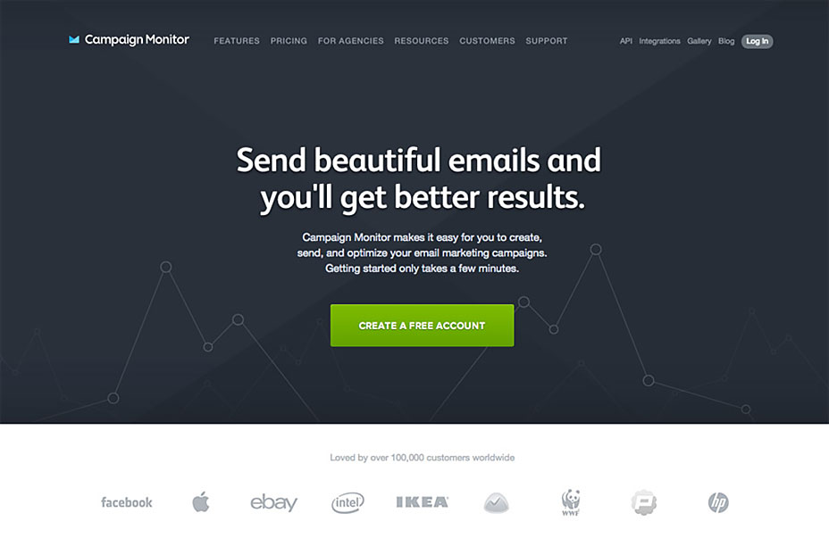
Campaign Monitor lets people design attractive email campaigns. Their landing page uses a clear CTA. It spells out the feature (“Send beautiful emails”) and the benefit (“You’ll get better results”) in one simple USP.
The best part about this example is its social proof aligning the bottom. Most people would recognize the logos for Facebook, Apple, IKEA, etc. It’s almost as if they’re asking, “These big names are using Campaign Monitor for their emails, shouldn’t you? “
2. Human
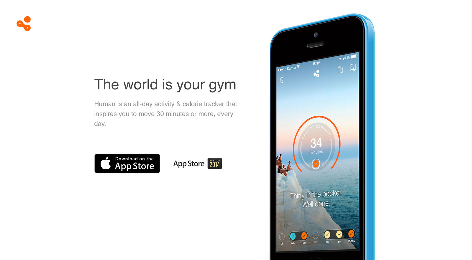
Human is an iPhone app that tracks activities and calories. It follows the Apple marketing well: the landing page is clean and minimalistic, but doesn’t fail to state all the benefits.
The CTA is the ubiquitous “Download on the App Store,” but the black button contrasts well with the white background, making it stand out. It boasts being one of the best apps in 2014, providing powerful social proof.
3. Instapaper
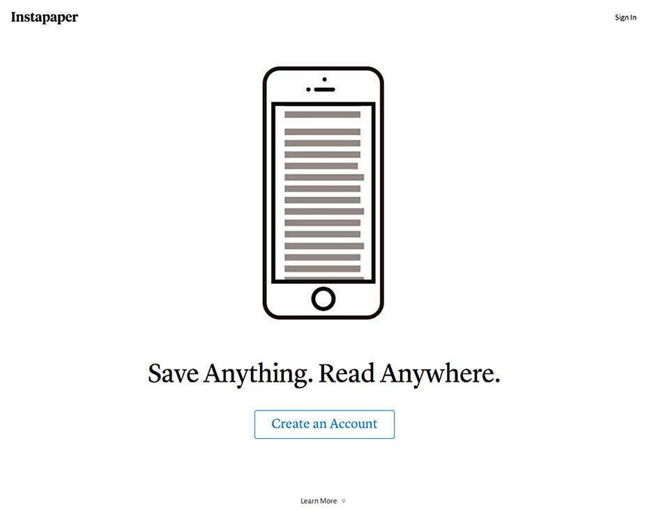
Instapaper is a simple app that lets users save webpages for offline viewing later. True to the premise of the app, their landing page takes minimalism to the extreme.
The strong USP, similar to Evernote’s, makes clear what the benefit of downloading this app would be. The CTA could stand out a bit more, but it has enough contrast around the text. Also, because the page is so uncluttered, it’s hard to not see it anyway.
4. Intercom
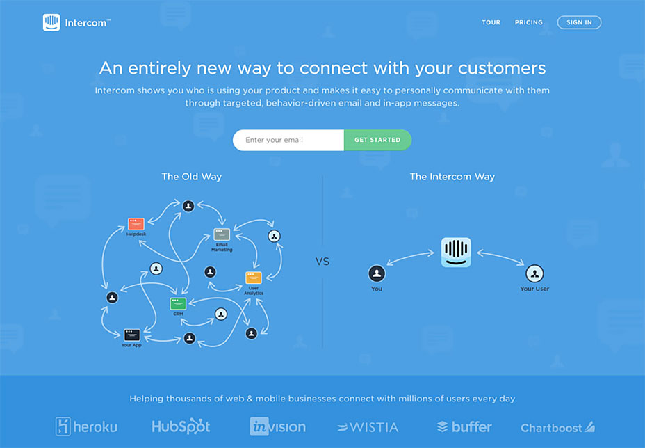
Intercom specializes in user experience and customer communication. What does that even mean? Thankfully, the landing page does a good job of distilling this complicated business model down to something more palatable, by using an attractive illustration.
The page’s background is somewhat subdued, so the green CTA button really stands out. There’s plenty of social proof too, listing the companies using this service.
5. Manpacks
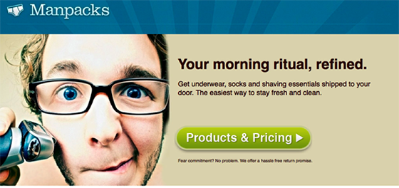
Manpacks ships underwear, socks, and shaving essentials to their customers. While this business model might give credence to the age-old stereotype that some men are just really lazy, their landing page has been consistently showcased throughout the years.
This is just a small part of the landing page Manpacks uses, but it shows a deep understanding of benefits-driven copy. Benefits that people love are often related to time, money, and looking good. Manpacks manages to convey that in three sentences. Things shipped to the door save time. Looking fresh and clean? Who wouldn’t want that?
6. Michael Hyatt
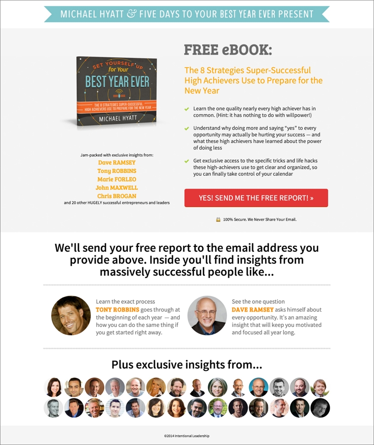
Michael Hyatt is a former CEO and bestselling author. He’s well-known in the leadership and personal development sphere.
He used this landing page in the beginning of 2015 to capture email addresses. It’s attractively designed and has a clear value proposition – a free e-book, rather timely for the New Year.
His most prominent social proof is a famous and sought-after duo: Tony Robbins and Dave Ramsey. The CTA really stands out and it’s not ambiguous. Once you click on that red button, you pretty much know what you’ll be getting. Overall, this landing page incorporates all 5 essential elements with flying colors.
7. Pat Flynn
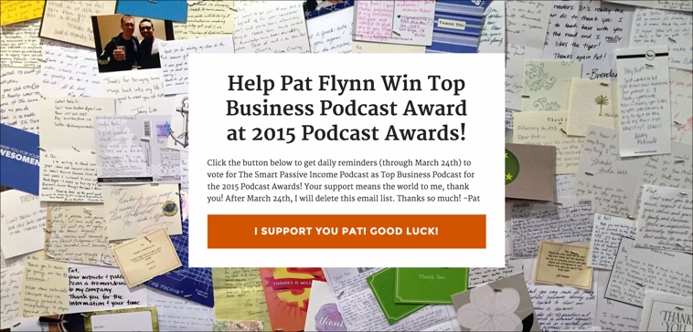
Pat Flynn is best known for his website, Smart Passive Income. This is a pretty unusual landing page, but it works on an emotional level. He really connects with his readers by thanking them repeatedly.
There’s no confusion as to why he wants you to click that orange button. Of course, this type of landing page requesting endorsement only works if he has a good relationship with his readers.
8. Review Miner
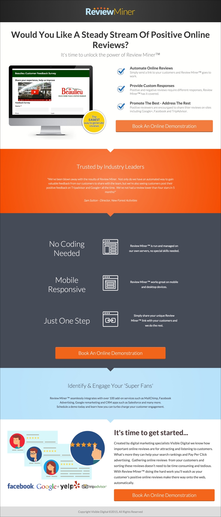
Review Miner gathers online reviews for businesses and sorts them for better customer response and feedback. This landing page is quite long, but what works well is the repeated CTA buttons.
It lists all the elements of a successful landing page in a logical order. “Would you like a steady stream of positive online reviews?” What business would say no to that?
It has a simple benefits-driven copy and a rather prominent social proof. This landing page proves that the length is not a big factor, as long as all the right elements are in place.
9. Squarespace
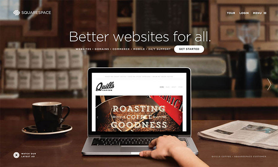
Squarespace is a website-builder for the code-challenged. Even though drag-and-drop templates have come a long way since Geocities, it’s still a pain to build a website without knowing how to design, code, or use WordPress. Squarespace takes that pain out, and they clearly communicate that in their landing page.
This landing page’s strength is the imagery. You instantly understand the story this image is trying to tell: someone working at a coffee company is making his own website. It’s aesthetically pleasing and the CTA really stands out against the dark background.
10. Thank You/Webinar Registration Page
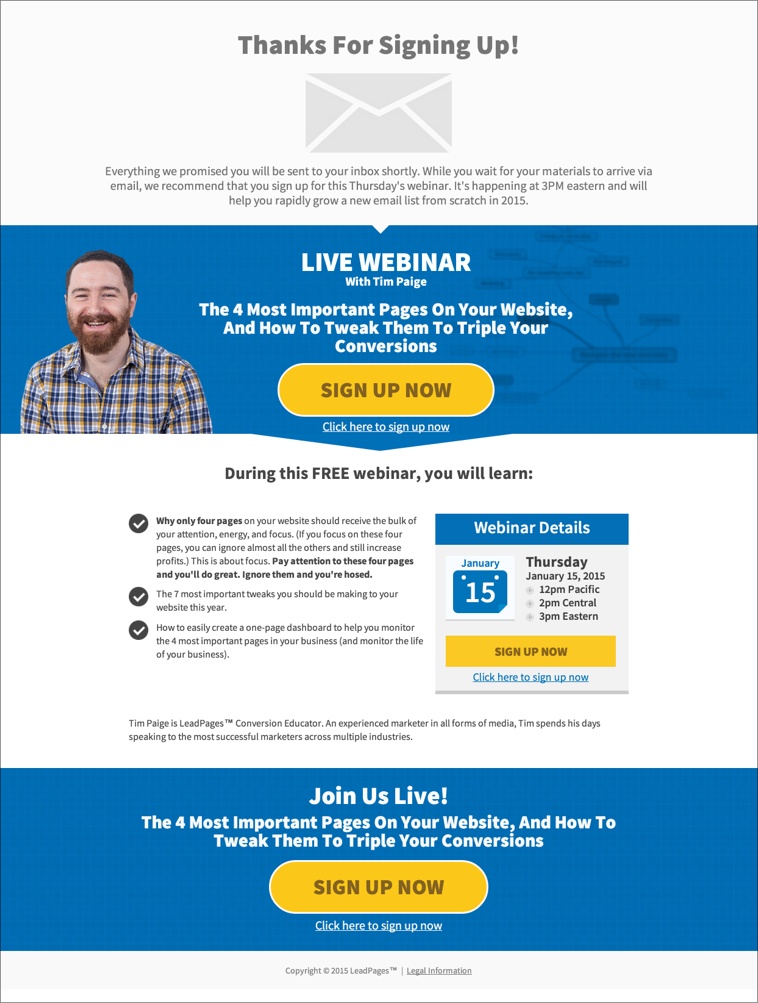
This page was designed specifically to drive more attendees to a webinar. It’s different from all the other landing pages in that it appears after visitors initially opted in.
How many times have you given your email for something and got your freebie, but didn’t know what to do after that? Perhaps you were waiting for another series of autoresponders. A thank-you page with actionable steps that immediately follow the opt-in process gives the visitors another high-value action.
The best thing about this is, it doesn’t cost any money to send additional traffic to this page. Visitors have already opted in.
Instead of a soulless thank-you page, the marketer for this webinar just built something that actually adds to the bottom line, while serving the visitors.
The Takeaways
What do most these landing pages have in common?
a) They have a short USP that’s not generic or boring.
b) They’re focused on the customers, not about how great their businesses are. The world is your You will get better results. You will look fresh and clean. With landing pages, people want to know what’s in it for them.
c) The images are complementary and relevant. It’d be pretty weird to have images of a bunch of computers on a dating website, like this one:
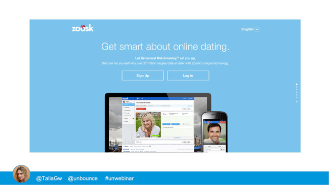
Sure, it’s about “online dating,” so maybe having computer and smartphone screens might work. But those images don’t resonate emotionally with people looking to date.
But the examples listed above are all highly relevant, without taking away from the core message.
d) The main CTA is always close to the headline. Visitors shouldn’t ever have to scroll for ages just to get to the CTA button. For long landing pages, CTA is repeated multiple times throughout the page.
e) Social proof is included in most cases. It serves as an endorsement and eases visitors’ doubts about whether certain products or services would help them.
A landing page is a fascinating combination of writing, design, marketing, and psychology. When all the stars align, it can make for a powerful sales tool.