The “Two Kinds of People,” a series of simple illustrations by a Portuguese art director, made the rounds recently. Here’s another one for you:
You either empty your email inbox or let it pile up.
If you’re in the latter category, take a look at your email inbox. You might notice a lot of promotions, newsletters, blog updates, and so forth. Some of your email could be spam, but nowadays, email services do a fairly good job of filtering out spam and sending it to its oblivion, aptly named a “Spam” or “Junk Mail” folder.
So it’d be a fair assessment to say, you gave away your email address willingly in a lot of instances. In many of those cases, you probably did so on what’s known as a landing page.
What is a Landing Page?
Quite literally, a landing page is a page you “land” on. In the internet marketing speak though, a landing page has a specific purpose: conversion. Conversion can come in one of many ways from visitors:
- Joining an email list
- Purchasing something
- Registering for an event
- Clicking through to another page
Unbounce defines 2 basic types of landing page – click-through and lead generation.
Click-through landing pages act as the in-between for a marketing ad and its final desired goal (a sales, for example). Visitors land on click-through pages after clicking on an online ad, from social media sites, search engine page results, or email campaigns.
Visitors need to be “warmed up” sufficiently in order to buy a product or service. If the ads they clicked on sent them directly to a shopping cart, they’d probably turned off and leave. Click-through pages provide information and details about products to warm up the visitors, encouraging them to make an informed decision.
Once the visitors decide to make a purchase, they “click through” to the final page, which is often the shopping cart.
A landing page for lead generation has the sole purpose of obtaining visitor information: a name and email address. This is better known as a squeeze page.
What is a Squeeze Page?
Many people use “landing page” and “squeeze page” interchangeably, but there is a subtle difference. A squeeze page is a type of a landing page, specifically designed to capture (or “squeeze”) the most coveted piece of information from a visitor – an email address.
A squeeze page’s call-to-action is almost too hard to miss. It’s a giant button with the texts “Subscribe,” “Download,” or the likes, right below a text box where you type your email address in. That’s an “opt-in” box.
People are generally wary of giving out their email, so a squeeze page also tends to list a short blurb about their privacy standards.
Because the chief objective of a squeeze page is to gather email addresses, marketers tend to keep it at a minimum. They use a simple “lead magnet” – a freebie to entice visitors into downloading the information, in exchange for their email.
The type of lead magnet can vary depending on the visitor profile and products or services offered, but some of the common ones are:
- A cheatsheet
- A toolkit or resource list (“350 best online apps for project management”)
- A short but insanely useful e-book
- A free trial or download
- A free consultation
- Notification of an upcoming product launch
A squeeze page is somewhat of a hybrid between art and science. To keep visitors glued to the page, a typical squeeze page almost always has no hyperlinks and navigation. Marketers experiment with various copywriting techniques, color, audio, and video.
A truly effective squeeze page is a fascinating display of buying psychology at works, with testimonials (offering social proof) and scarcity (who doesn’t like “limited time offer?”).
Why Marketers Use Landing Pages
A landing page is specifically designed to convert visitors into leads or buyers. That’s why when visitors arrive on a landing page, it looks different from the rest of the website. It’s essentially a standalone page that has no external links (to keep visitors focused on the message) or navigations that tie it back to the primary website.
Think of a typical website. It’s informational and has many links: home, about, services, portfolio, blog, contact, etc. It does a good job of presenting an overall brand or message, but not every page “sells,” so to speak.
When visitors arrive on a page after clicking on an ad, they expect it to match what they saw on the ad. Not every page on the primary website has this capability. Using landing pages keeps the focus undiluted and gives the visitors only what they want – a message about the product or service they saw in the ad.
Elements of a Landing Page
A landing page is a fairly new marketing technique, only specific to the internet. But the principles used borrow from direct-response ads that go decades back. According to Unbounce, successful landing pages generally stick to the following 5 elements:
1) The Unique Selling Proposition (USP)
The web is littered with literally thousands of similar products and services. What sets the businesses that sell them apart from those who don’t? It’s the Unique Selling Proposition. It has to speak to the visitors without sounding dull. No easy feat.
A USP is broken down to headline, subhead, the reinforcement statement, and the closing argument. These 4 parts are sprinkled logically throughout a landing page.
The main headline is what people will see first, so it’s critical that it matches the ad they clicked on. This principle is known as “message match.”
2) The Hero Shot
The hero shot is the visual component of a landing page. It usually has a large image or video. It needs to be compelling, placing visitors in a scenario where they’ll most likely use the product (context of use). With the hero shot, a picture really is a worth thousand words.
3) The Benefits
You might have come across this copywriting adage: spell out the benefits of the benefits. The whole features vs. benefits boggle many people. It’s easy to ramble on and on about what a product or service does. It’s hard to get inside people’s head and really dig into how that product or service can make their lives better.
Feature: A responsive website
Benefit: A responsive website so you can get more visitors on their mobile phone, which can turn into more prospects, which can turn into more money!
Because really, who doesn’t like more money? Some common benefits that resonate with people include:
- Money (more prospects, more sales)
- Time (saving time, or allowing someone to spend more time with their loved ones)
- Looking good (in front of a boss, client, spouse, etc.)
It’s important to keep the benefits short and sweet, instead of using long paragraphs. People generally don’t read every word, especially on the web.
4) Social Proof
Social proof builds trust and credibility. People are social animals, no matter how introverted or reclusive they are. That’s why testimonials and customer reviews work so well. If you use sites like Yelp or TripAdvisor, you know how much you rely on social proof yourself.
5) The Conversion Goal
In the end, a landing page is only as good as its call-to-action (CTA). Usually a form, button, or click-through page, it’s the final action that marketers desire from their visitors.
A CTA has to be prominent and unambiguous. A poor CTA is the mundane “Click here!” or the worst of all, “Submit.” A good CTA is something more specific and action-driven, like “Get your free e-book on how to lose 50 lbs. in 6 months.”
Examples of Effective Landing Pages
Keeping the 5 essential elements of a landing page in mind, here are some examples of good landing pages.
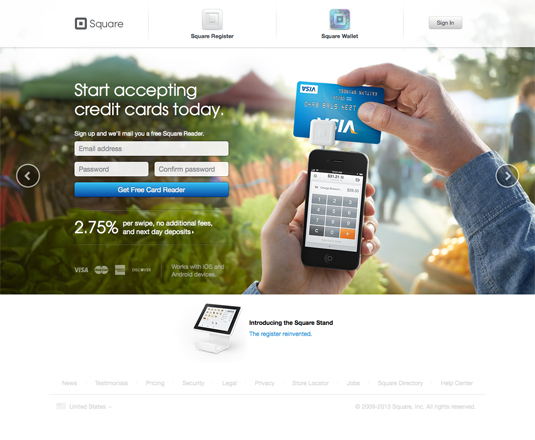
1) Square
Square lets businesses accept credit cards on their smartphones. It’s incredibly simple but has the elements that make a good landing page design.
a) “Start accepting credit cards today.” It drives the point straight.
b) There’s no confusion as to what Square card reader does or how you can use it, all from the simple image.
c) The benefit is unmistakable. Give them your email address and they’ll send you a free card reader.
d) Clear call-to-action – it’s impossible to miss that blue button.
2) Cheezburger
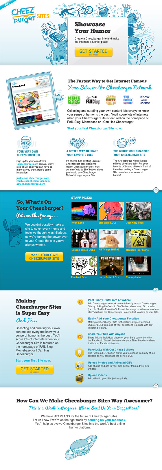
If you like proper grammar, this site might make you shudder. But for those wanting to share a meme or generally funny (and stupid) stuff, Cheezburger makes the benefit of signing up pretty clear.
a) It’s free to sign up and use, and they let you know it.
b) Multiple CTA buttons are useful here, because the landing page is a bit lengthy.
c) There’s a lot of text, but the content is segmented in a way that’s easy to skim.
3) Evernote
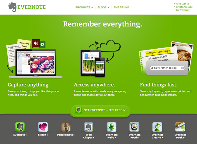
a) “Remember everything.” Who would’ve thought merely two words would convey so much meaning?
b) Each image has a corresponding benefit that’s easy to visualize.
c) The CTA is prominent and you don’t have to question what you’re signing up for.
In the most extreme cases, a landing page can make or break a sale. It’s easy to drive away potential customers or subscribers with wrong message.